
Jeeves ERP – Modernizing enterprise UX for factory workers
Project Overview
Jeeves ERP is a leading ERP provider serving over 4,600 companies across more than 40 countries, with tens of thousands of users worldwide. Their ERP solutions cover key business areas including finance, supply chain, inventory, production, sales, purchasing, and service management. Despite its success, the ERP industry is still dominated by outdated applications with limited focus on user experience and UI.
This project set out to challenge that norm and explore how Jeeves could establish a new benchmark for modern ERP products. The goal was to design a concept that combined strong visual identity with a seamless user experience — told through the eyes of a factory worker. The concept was created to work fluidly across mobile, tablet, and desktop.
As lead UX designer for the Jeeves Signature Experience project, I was responsible for shaping the overall user journey of the new ERP system.
I contributed in various key phases of the project:
Translate business goals into user-centered objectives
Conduct user research, interviews, and workshops to uncover needs
Define UX vision, principles, and design strategy
Align stakeholders around a shared product vision
Lead the end-to-end design process (concept → delivery)
Map out and set monthly, weekly and daily goals
Facilitate workshops with cross-functional team
Bridge communication between business, tech, and design
Team Structure
The core team included me as Lead UX Designer, an external UX Designer whom I hired and onboarded to collaborate closely on design, and a Program Manager who acted both as project manager and ERP domain advisor. In addition, we had access to a reference team that enabled quick user testing and continuous feedback on our design.
0️⃣
Outcome
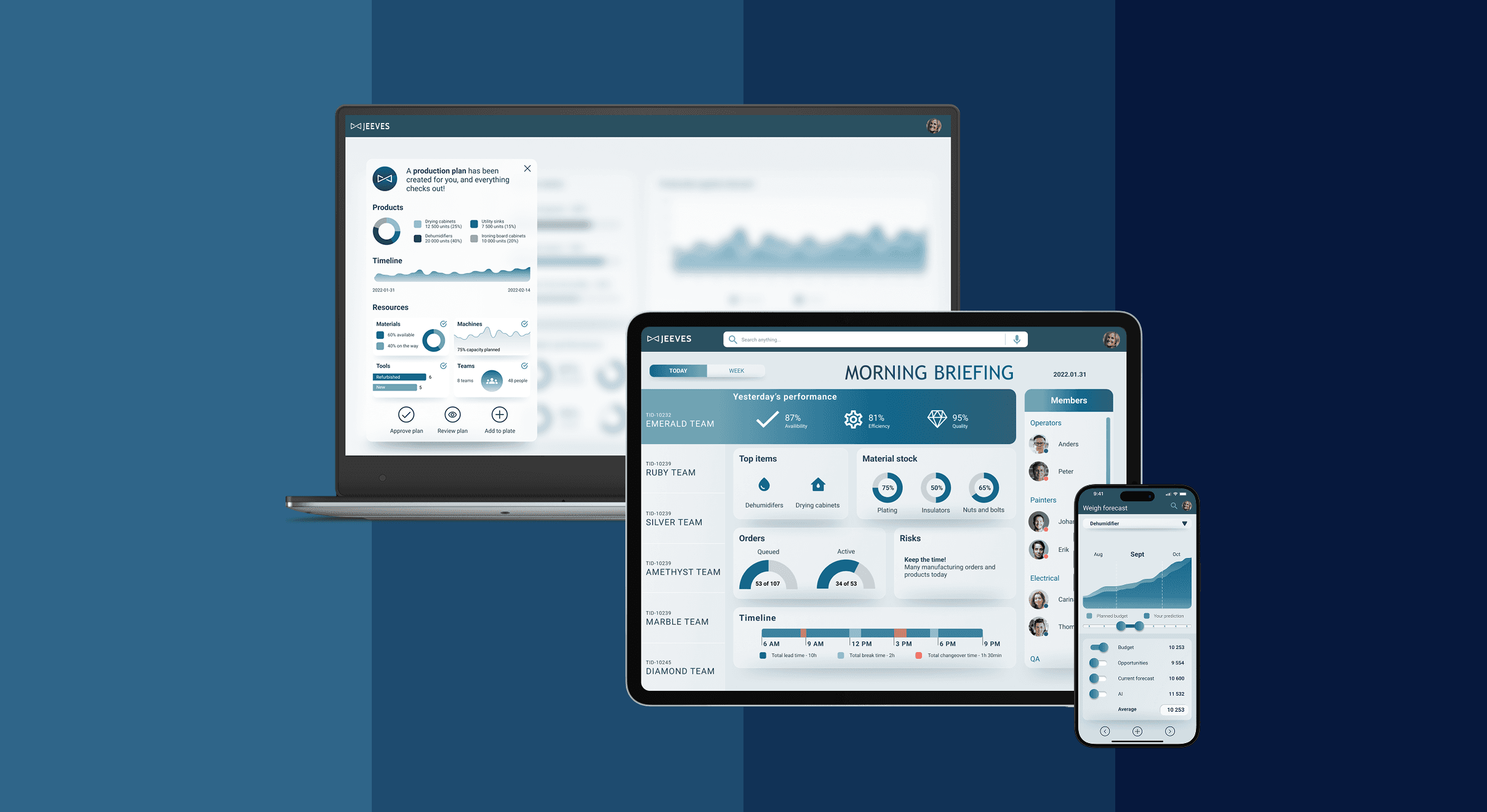
The final prototype demonstrates a seamless daily flow for factory managers: monitoring production values, taking action, and navigating across devices.
Impact
Business: Showcased Jeeves ERP as forward-looking and design-driven
Users: ERP systems could become more intuitive, approachable, and visually engaging, transforming from rigid business tools into experiences that feel effortless, empowering, and even enjoyable to use.
Promotional: Integrated into a film, presented at internal and customer events
1️⃣
Core Challenges
Complexity and unintuitive workflows in existing ERP systems
Outdated visual design
Steep learning curve for end-users
2️⃣
Design Process & Iterations
Discovey
I conducted research and interviewed people both inside Jeeves ERP and externally, reviewing job applications and industry insights within the factory worker sector. From this, I developed 12 distinct personas. To focus the design process, I selected 4 key personas to target. This approach gave me a deeper understanding of the industry—how people connect and collaborate, their daily responsibilities, what motivates them, the challenges they face and pain points
Ideation
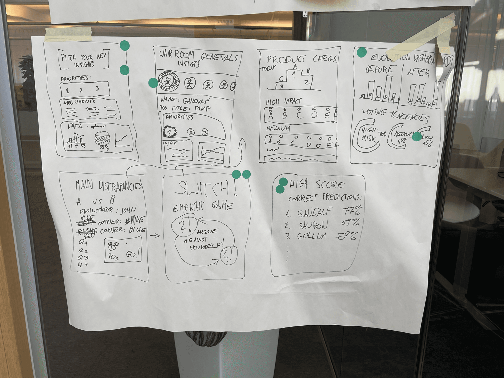
To be able to propel our work I reframed the problems into How might we questions that allowed us to open up the problem statements for more efficient, targeted and innovative ideation sessions. We choose to work with 6 top voted problems, down below you see 3 of them:
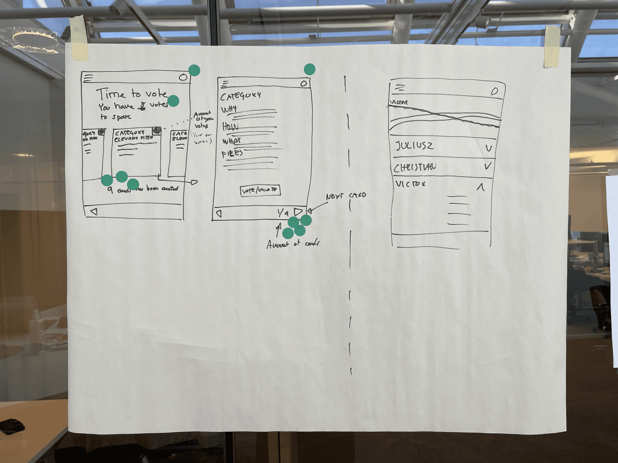
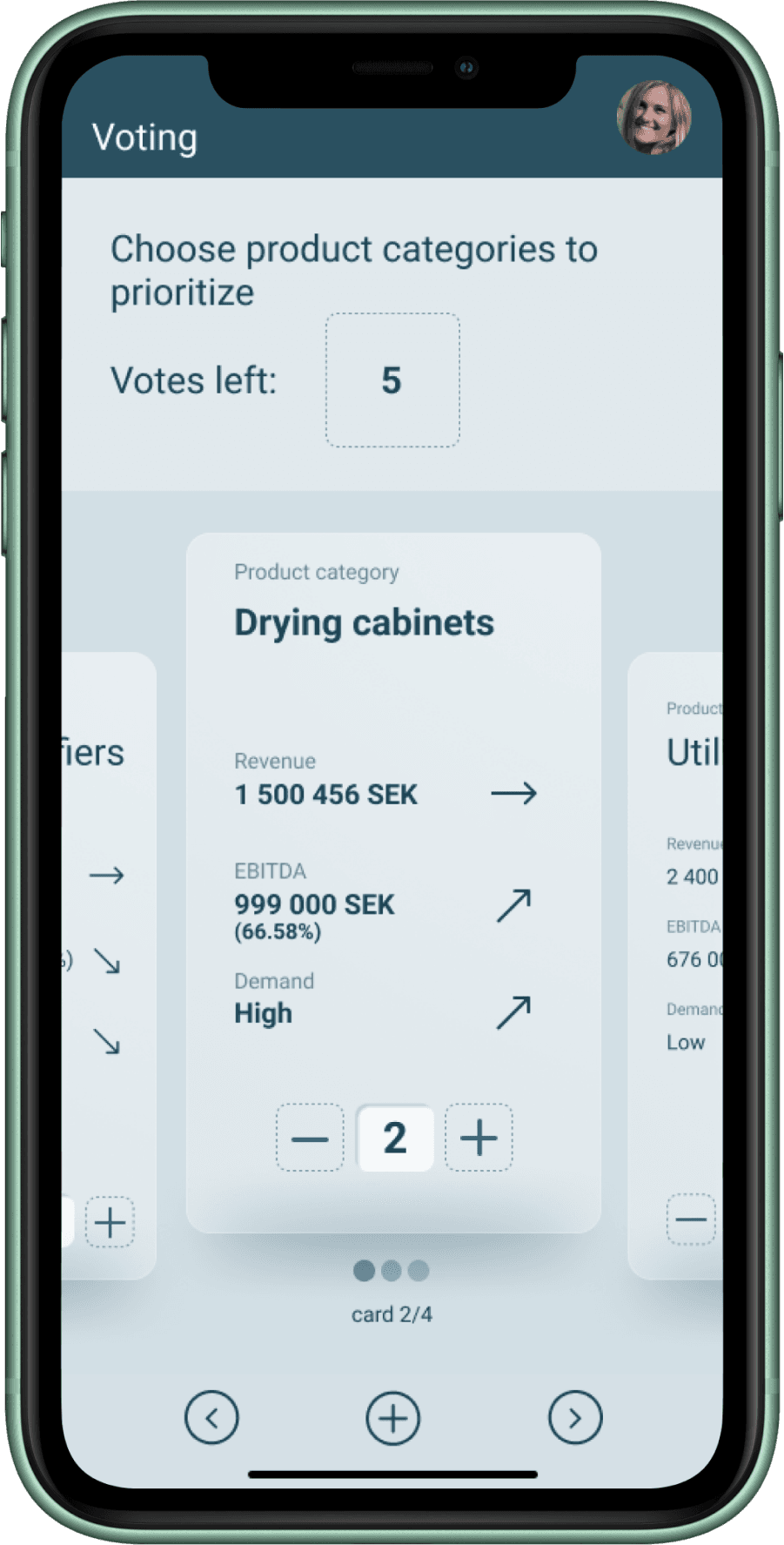
One of the key pain points identified was the lack of an effective tool for gathering, processing, and sharing information before and during planning meetings. To address this, the team prototyped a comprehensive flow for capturing and analyzing insights, and introduced a voting feature to democratize the decision-making process. The flow was ideated and scoped during a collaborative workshop with the core project team, and later validated with internal stakeholders.
After gathering our insights and potential problems, the team realized that we would not be able to solve every issue we had identified. We chose to focus our mission on making the tool more intuitive and beginner-friendly.
To do this, we decided to present our ideas and solutions as a story: a prototyped daily user journey of one of the system’s users. The team chose to tell the story of a factory manager’s daily work, integrating multiple touchpoints within a production factory. This narrative approach was particularly relevant because the production sector was a significant revenue generator for Jeeves ERP, allowing us to create a compelling, relatable story while highlighting new design elements that would deliver the greatest impact with the time and resources available.
With this direction in mind, I started scripting the concept, which not only clarified the project’s purpose but also guided the ideation process. We carefully mapped and analyzed all the necessary chapters of the user journey, breaking it down into individual screens. This resulted in a complete timeline of the journey, serving as a benchmark for wireframing and prototyping.
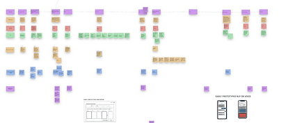
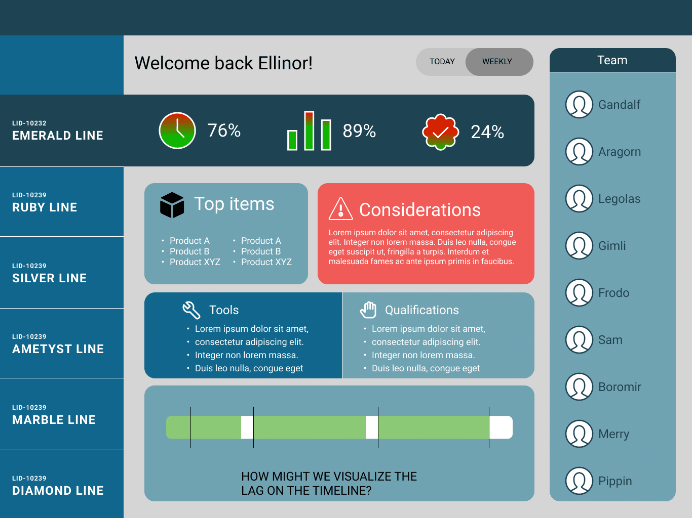
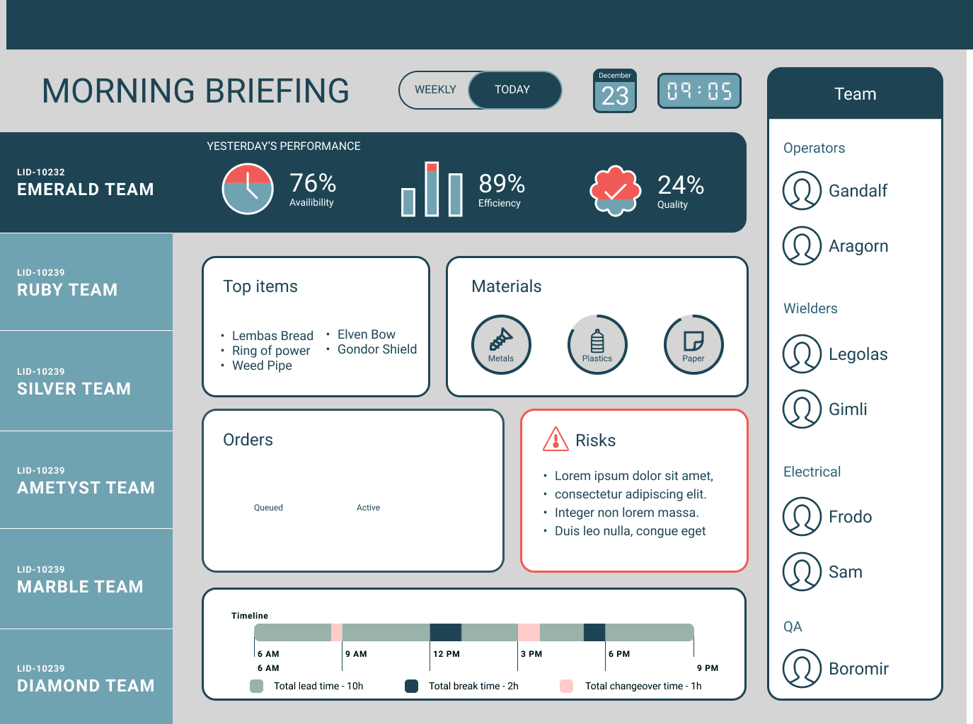
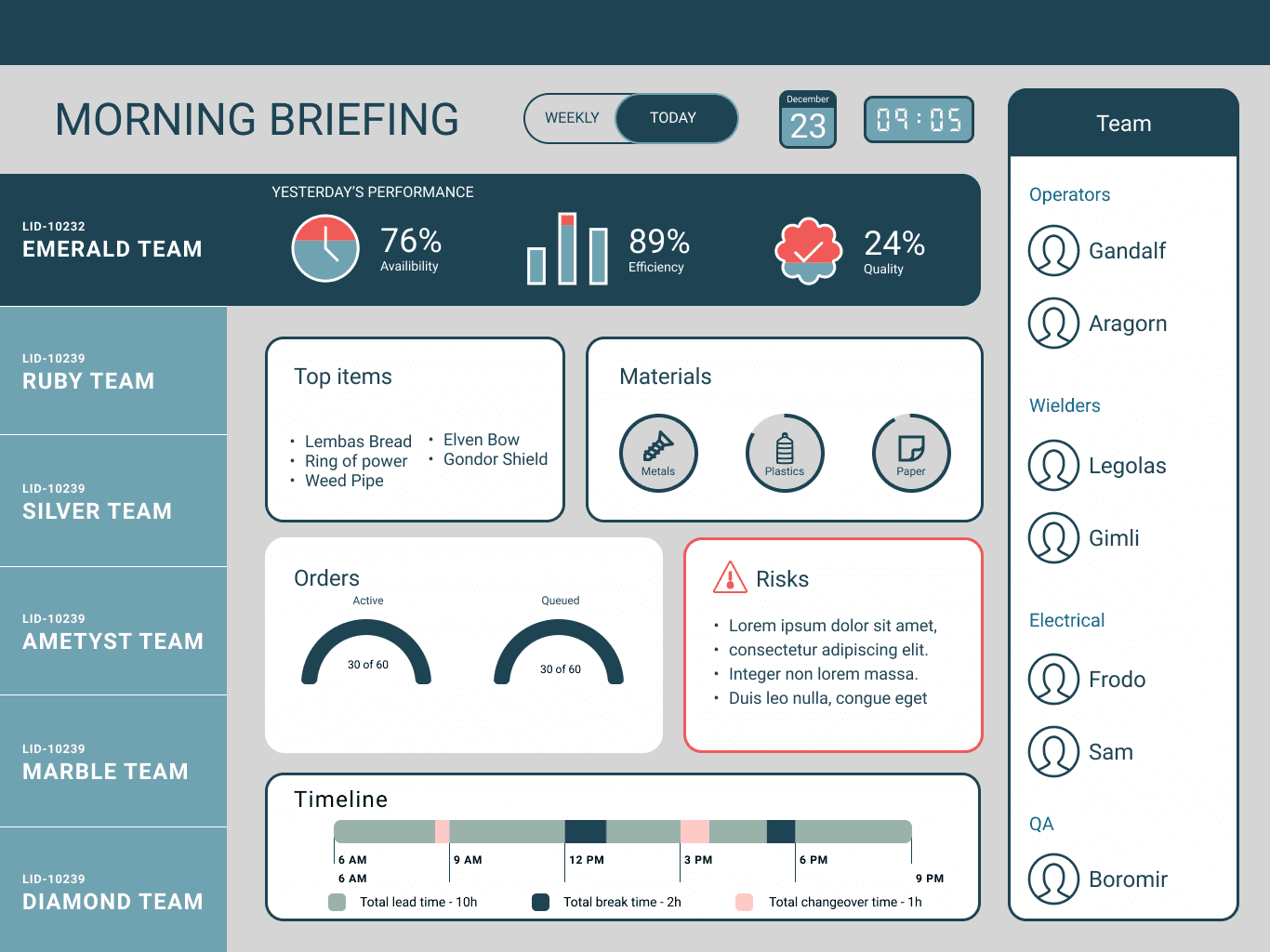
The story included 12 stages in 3 main sections spanning over mobile, tablet and desktop:
A morning briefing with a factory overview
An afternoon collaborative planning meeting
An evening deep dive into the data and schedule
Production
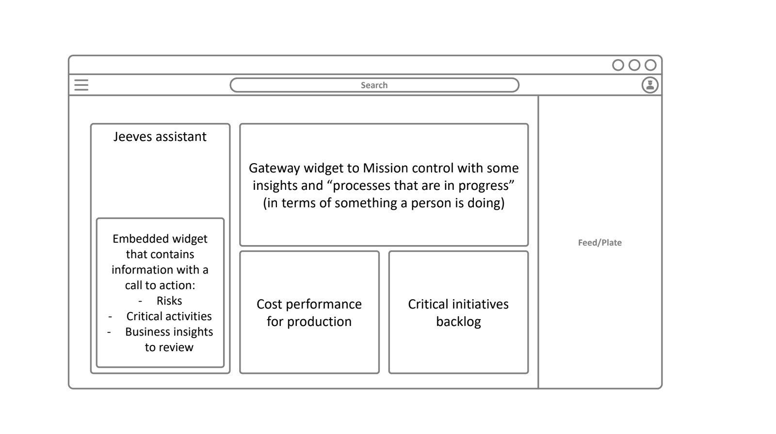
To begin the prototype design, we wireframed each stage of the user journey in Figma, carefully translating insights and identified pain points into concrete interface elements. This process allowed us to visualize interactions, map user flows, and ensure that each screen supported the overall narrative of the user’s day. By iterating on the wireframes, we were able to test layout, hierarchy, and functionality early, aligning design decisions with both user needs and business goals before moving into high-fidelity prototyping.
Validation and testing
After each design was completed, we debated it within the team and tested the solutions on our selected reference team and in-house volunteers. After completing the wireframing of the prototype, we started creating a Hifi prototype.
3️⃣
Visual design & UI decisions
We chose a glassmorphism-inspired visual design because it complemented the company’s brand identity, creating a modern and polished look that aligned with the established color palette and visual language. The approach not only enhanced aesthetics but also improved usability across the interface.
Key benefits and design decisions included:
Depth and focus: Semi-transparent layers created visual hierarchy, highlighting key information without overwhelming the user.
Clarity and hierarchy: Foreground elements stood out against blurred backgrounds, ensuring important actions and data were easy to find and interact with.
Brand alignment: The design reflected the company’s visual identity, reinforcing a cohesive and professional look.
User-friendly experience: The balance of aesthetics and functionality allowed for a clean, intuitive interface that supported efficient workflows
4️⃣
Delivery
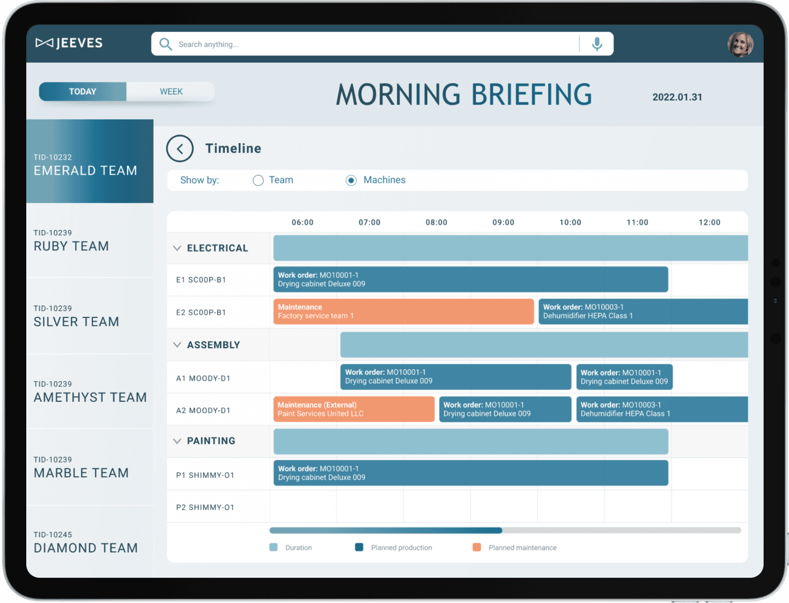
The final prototype was presented during a day with a factory manager, demonstrating how she navigated the interface on mobile, tablet, and desktop.
Morning
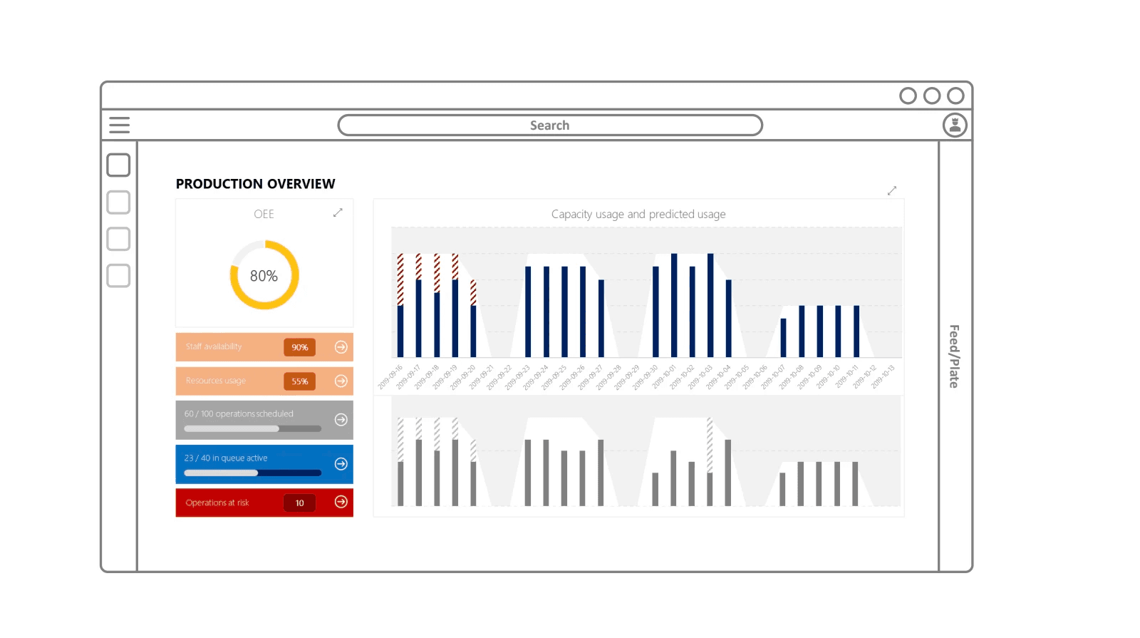
Enhancing operational efficiancy
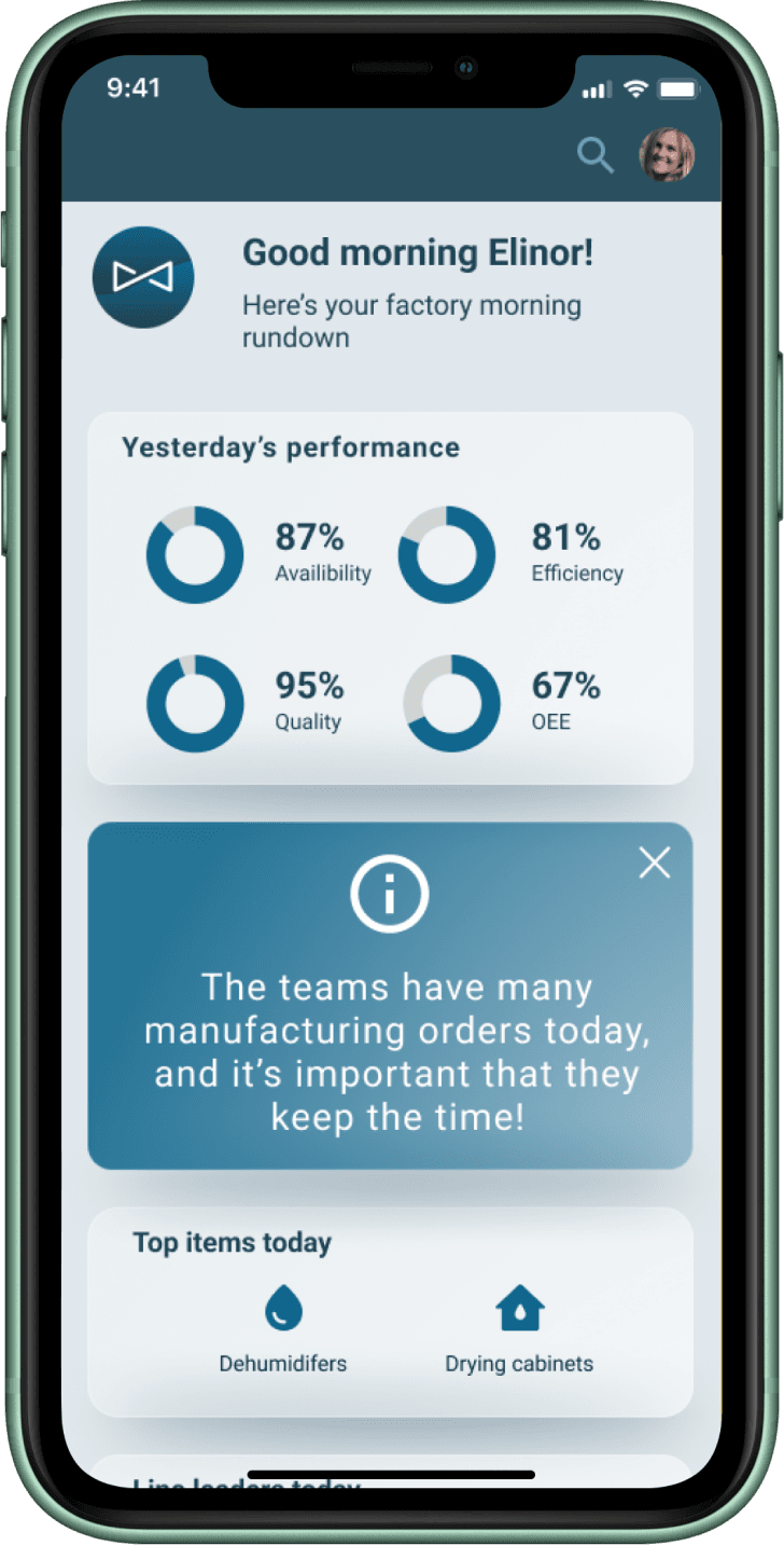
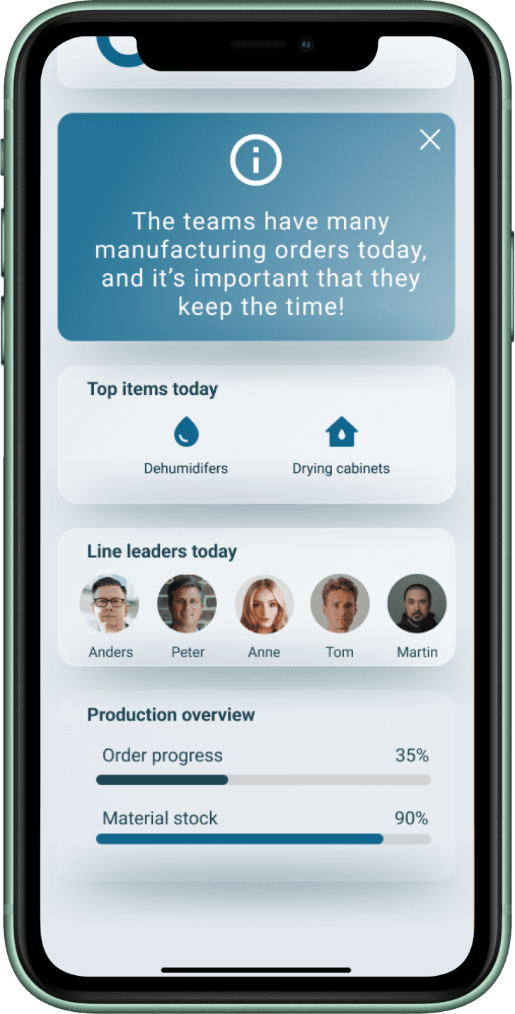
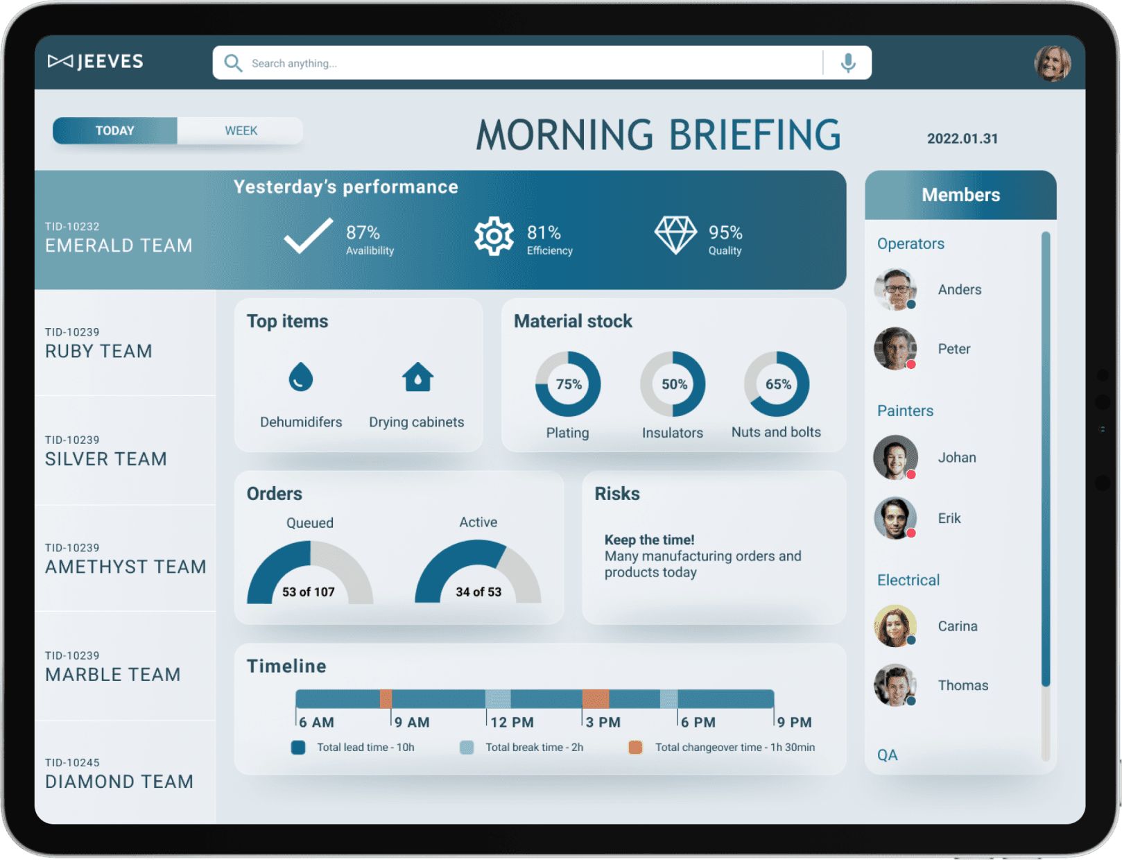
Quickly glance at overall factory performance with clear indicators and trends.
See top-priority items in production highlighted for immediate attention.
Review team workload at a glance, understanding who is handling what.
Monitor team utilization in an intuitive, visual format.
Afternoon
Structured insights to better planning
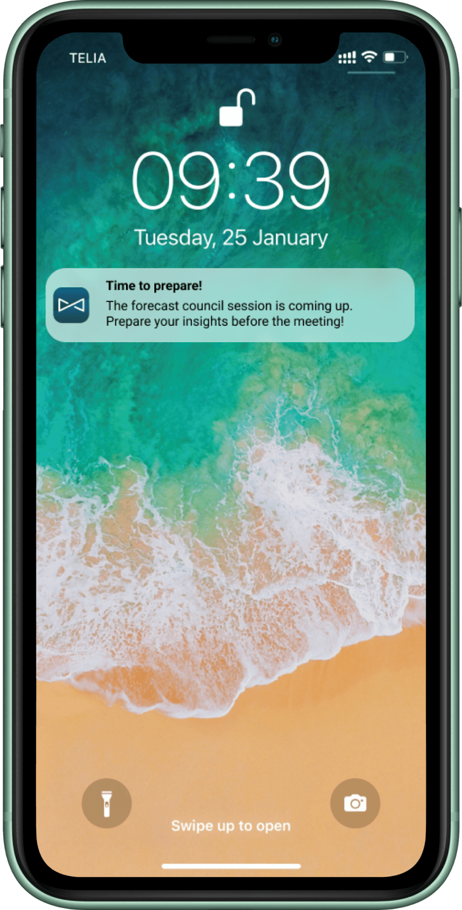
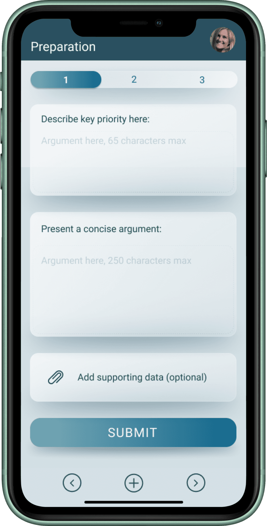
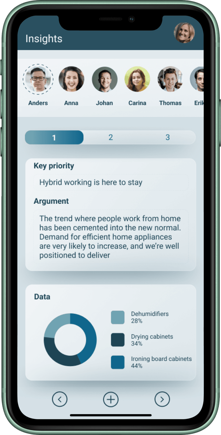
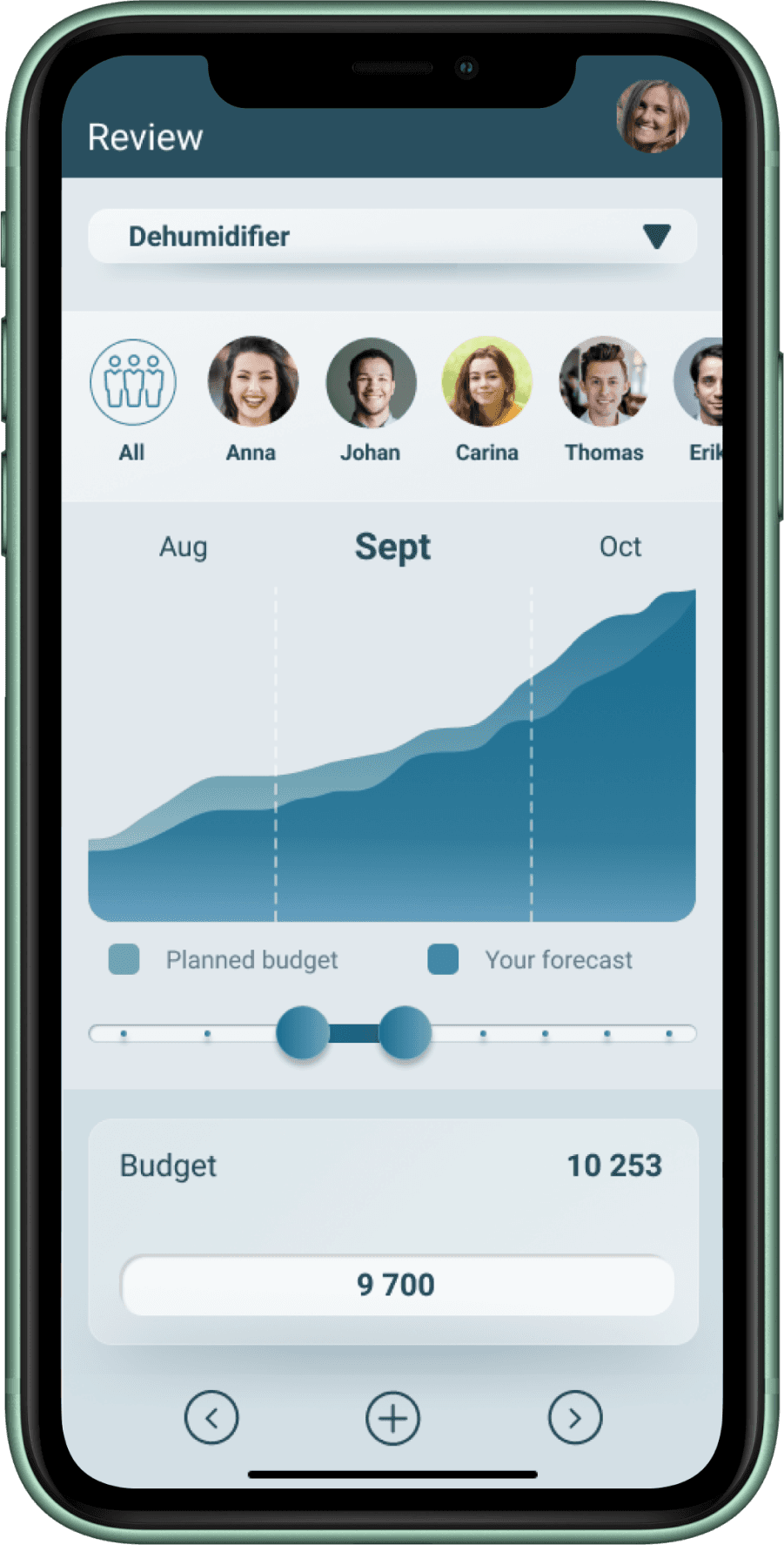
Preparation, gather key insights and get a clear overview of what’s needed for the upcoming meeting.
Share insights, present data and observations in a simple, structured format that’s easy for others to follow.
Voting, cast and view votes seamlessly.
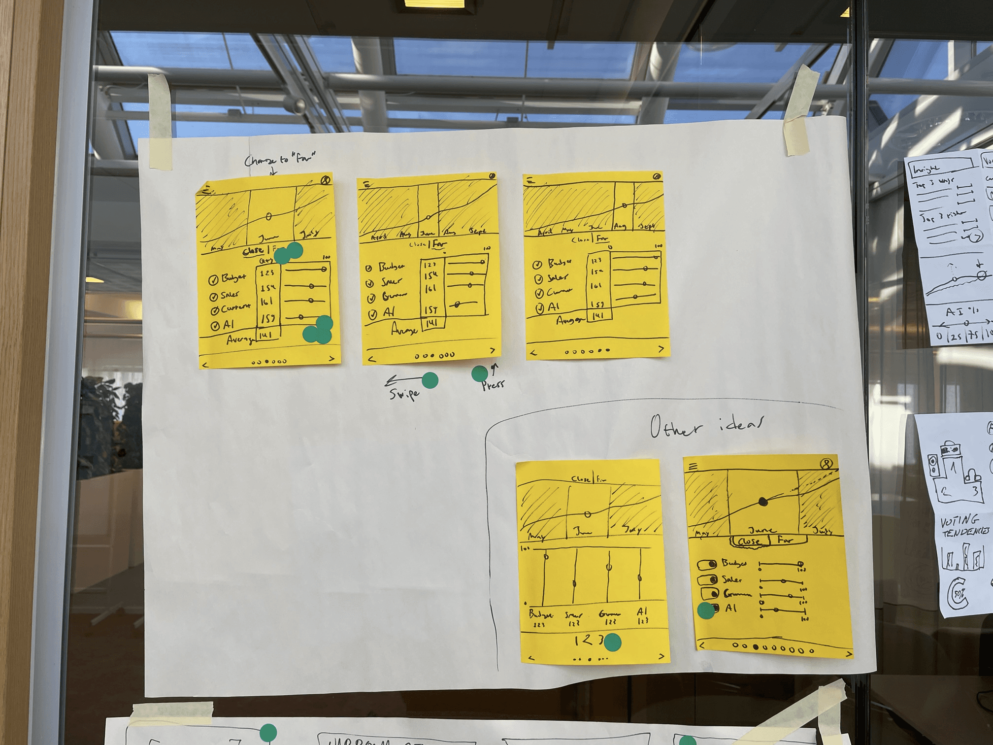
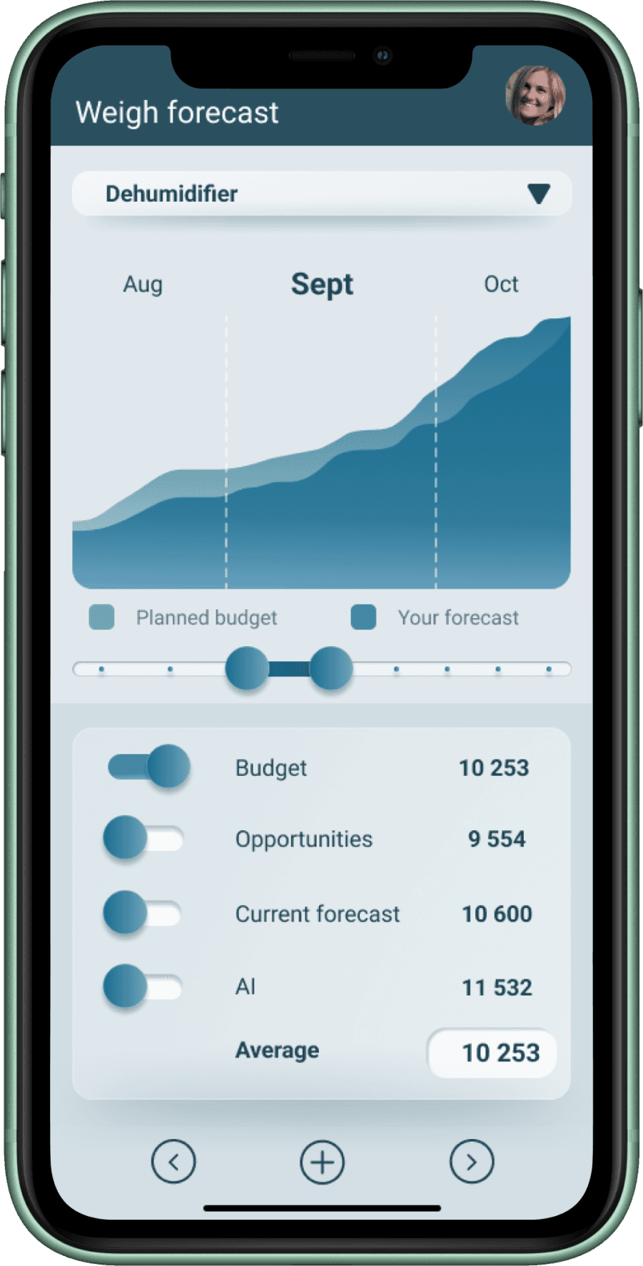
Weight forecast screen, adjust and balance forecasts collaboratively, supported by visual indicators.
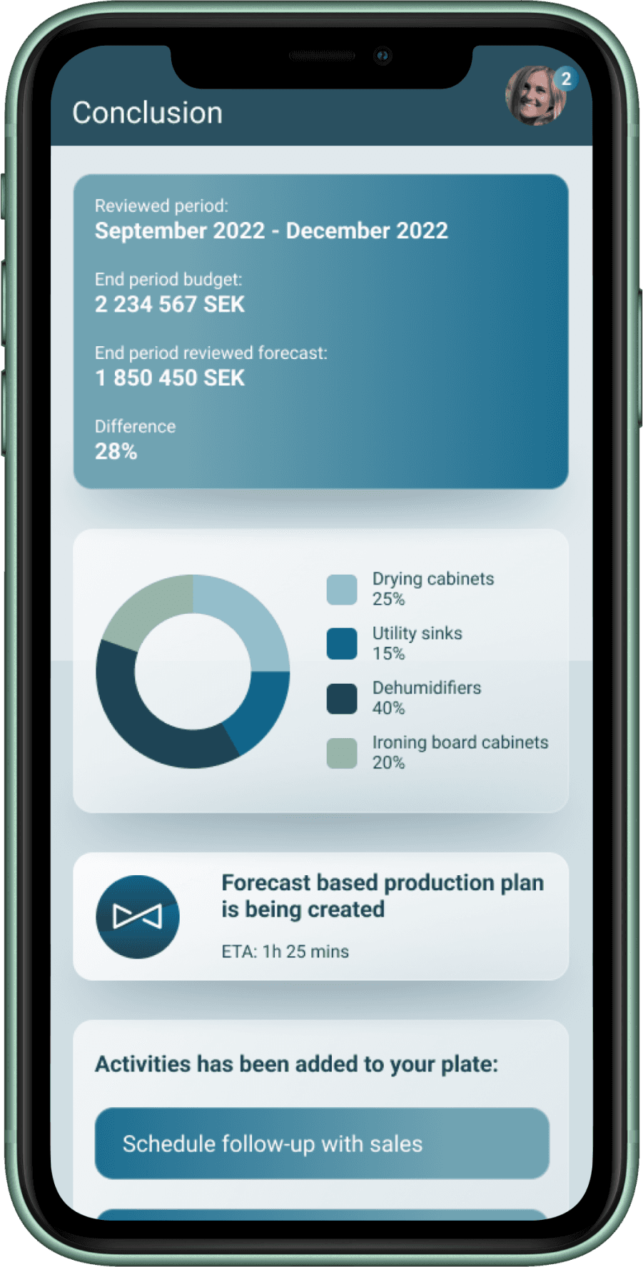
Review, compare inputs, track changes, and align on the final outlook.
Conclusion, summarize decisions and next steps clearly.
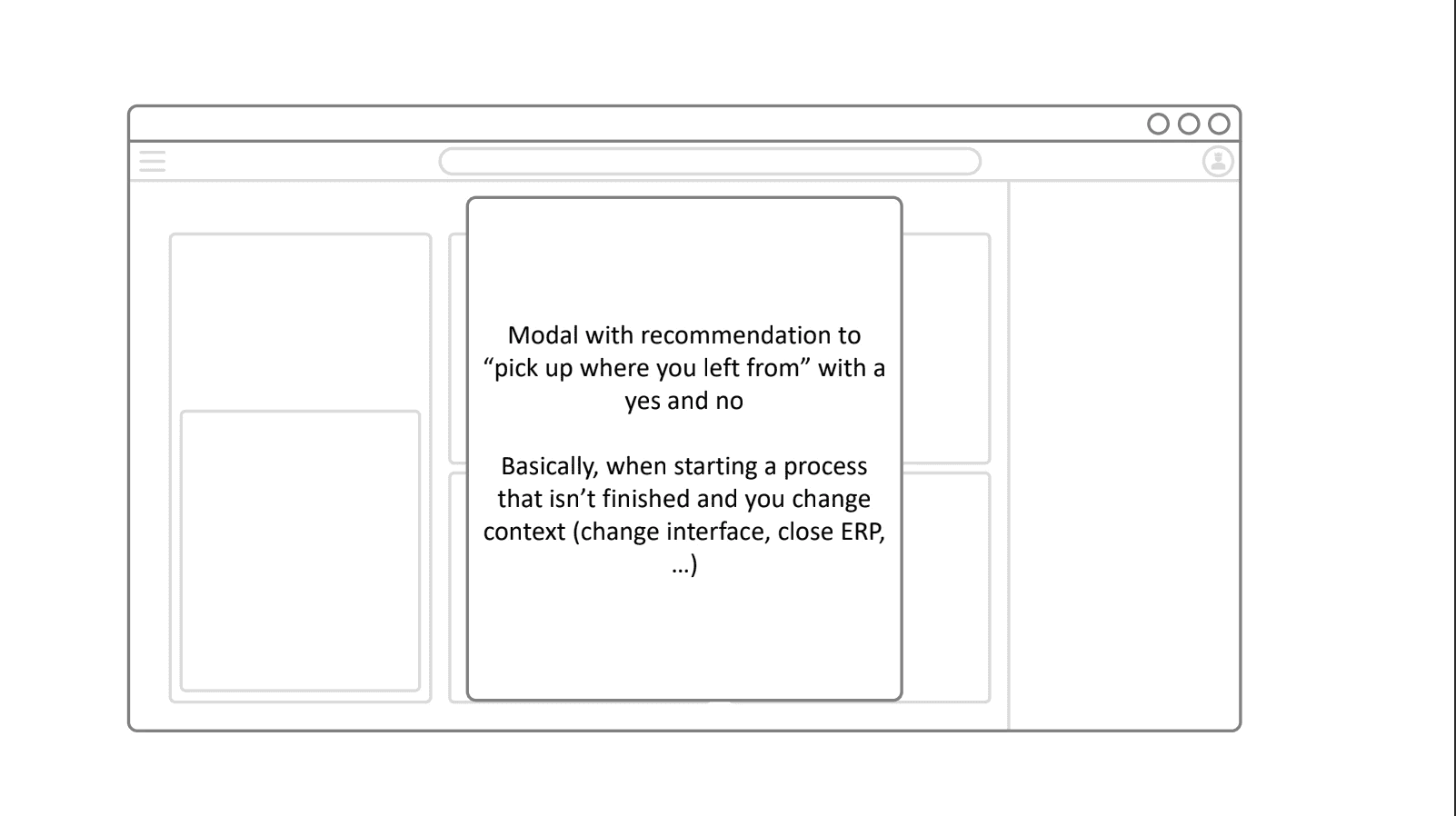
The entire experience follows a flow-based workflow, guiding the user step by step with a natural rhythm from preparation to conclusion.
Evening
Production planning

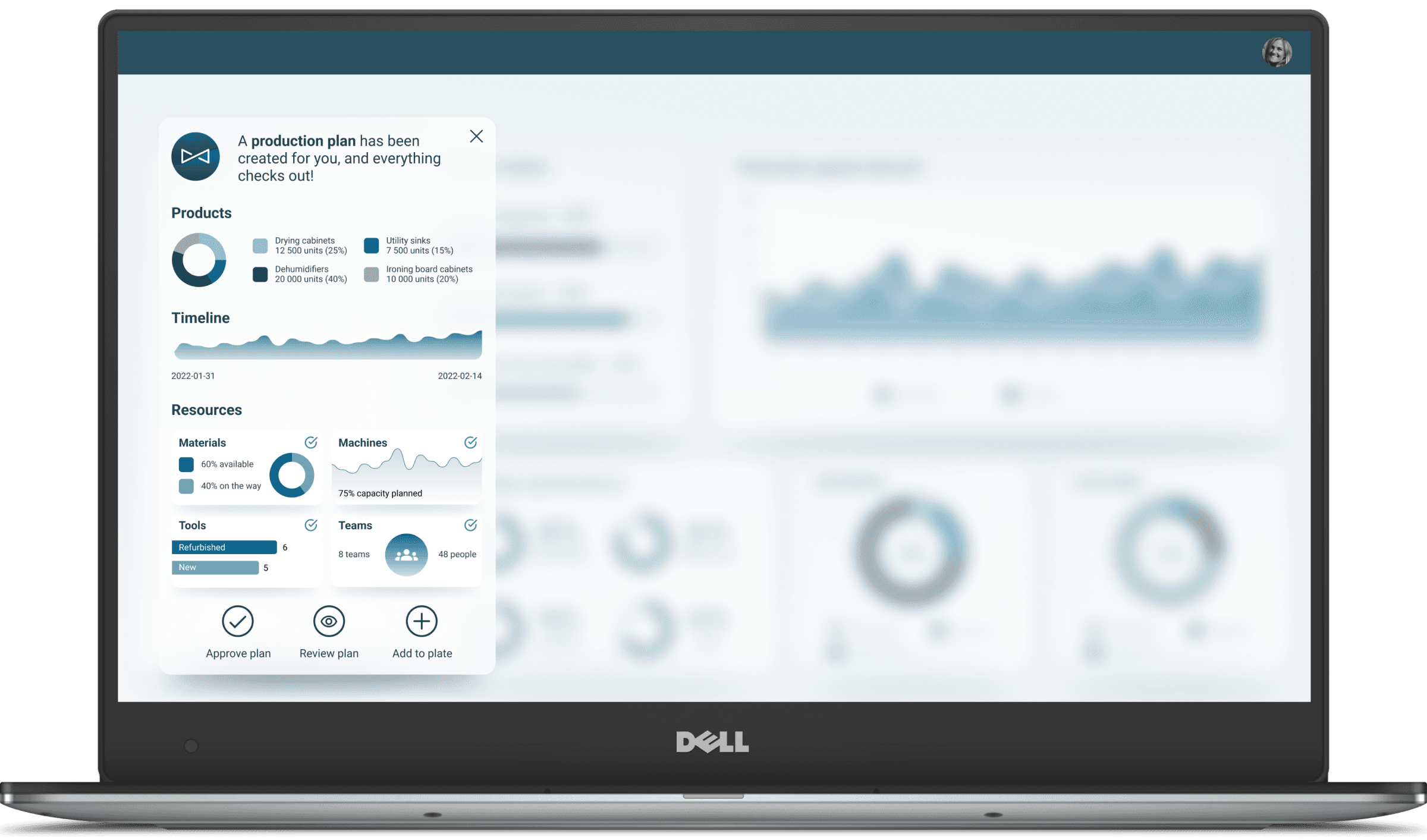
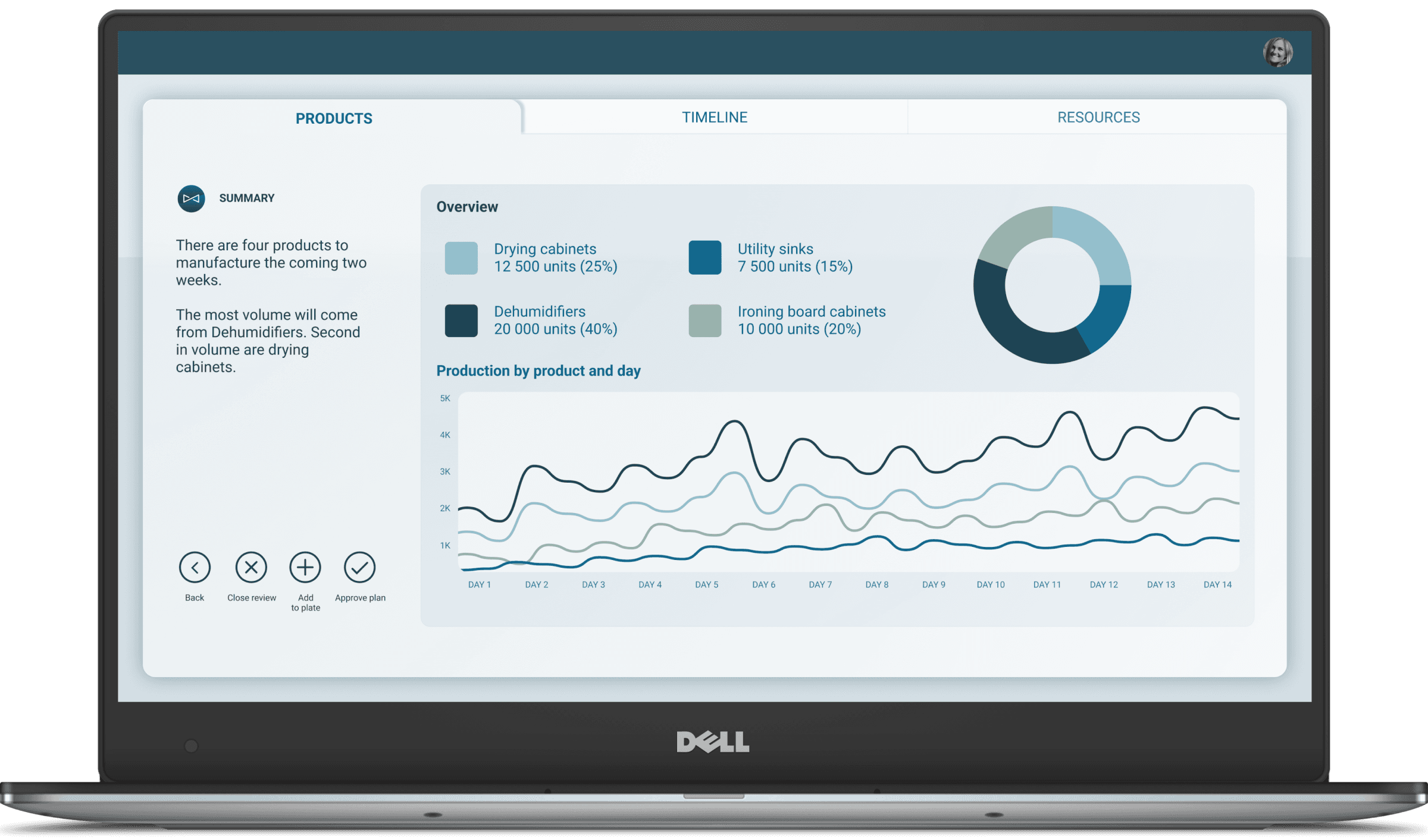
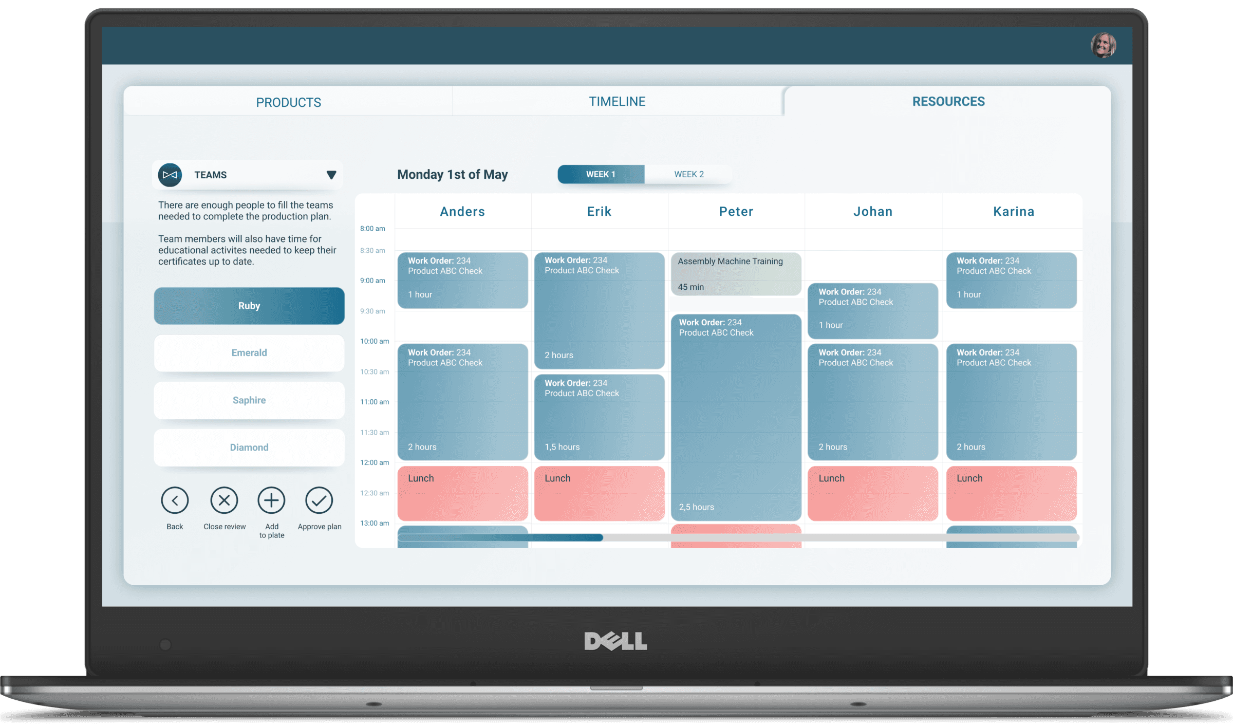
A clear overview of upcoming schedules and priorities.
Structured flow that connects planning, resources, and manufacturing outlook seamlessly.
Available resources and capacity at a glance, with visual cues that make adjustments intuitive.
Effortless navigation between views, always knowing where you are in the process.
Sense of control and clarity throughout, supported by a flow that guides rather than overwhelms.
Styleguide
Colors
Primary Color
#10668C
Secondary Color
#E1E8ED
Accent Colors
#98B3A9
#F15B57
Text
#10668C
#1E4454
#FFFFFF
Aa
Roboto is used as the primary font for maximum readability.
Text Level
Mobile
Weight
Usage
H1
34 px
32 px
28 px
Bold
H2
28 px
26 px
22 px
Medium
H3
22 px
20 px
18 px
Medium
Body Text
16 px
16 px
Regular
Secondary/ Caption
14 px
14 px
12 px
Regular
Aa
4️⃣
5️⃣
Impact & result
The final prototype set a new standard for Jeeves ERP by introducing a cohesive design language and component system that standardized the UI according to contemporary guidelines and best practices. Presented in a commercial film, it received positive feedback both internally and externally, encouraging the company to advance the product further. Beyond the prototype itself, the project had a wider organizational impact, demonstrating the value of design thinking and influencing future ways of working.
Key outcomes included:
Established a new design standard: Introduced a consistent design language and reusable components aligned with best practices.
Positive reception: Prototype showcased externally and internally, earning strong feedback and building confidence in the product direction.
Influenced company culture: Educated colleagues on design thinking, leading to adoption of UX practices across other teams.
Improved project execution: Highlighted the importance of buffer time, expectation management, and a “good enough” mindset to deliver on schedule without compromising quality.
Enhanced user experience: Marked a significant step toward a more intuitive and user-friendly Jeeves ERP, setting a benchmark for future products.
6️⃣
Reflection
What went well:
Strong alignment within the team
Established a new design standard: a coherent design language and component system that brought consistency to an otherwise fragmented UI.
Helped shift culture: educating colleagues about design thinking, improving clarity and alignment, and promoting best practices in UI/UX across teams.
Strong alignment between user needs and design, through personas, insights gathering, “How Might We” questions, rapid prototyping, reference team for quick and valuable feedback, and a user journey narrative. Resulted in a prototype that was both relevant and compelling.
Learnings:
Storytelling as a design method is highly effective for ERP and enterprise contexts
Even with good intention and planning, scope must be managed tightly. The case study notes there were many insights and problems, but limited time forced prioritization. That means identifying which issues to solve (and which to leave out) is essential.
Visual clarity and hierarchy matter a lot in complex UIs. Stripping away label text, using icons, loading bars, gauges etc., helped reduce clutter and prioritize what’s important.
Next:
Measure user performance and satisfaction: Introduce metrics (task completion time, user error rates, satisfaction surveys) to quantify improvements introduced by the redesign and to find further areas of improvement.
Expand UX best practices in the company: Build on the design thinking education, through internal workshops to ensure other teams follow similar practices.
Implement and iterate: Use the prototype as a foundation, but gather continuous feedback (from real users, in live settings) to refine the design, especially where the prototype makes assumptions or simplifies complexity.
7️⃣
Tighten the scope earlier: Prioritize the most impactful problems upfront to avoid spreading efforts too thin.
Increase user validation: Involve factory managers and operators more frequently throughout the process
Build a scalable design system sooner: Establish a stronger foundation from the start to make it easier to scale the design across Jeeves ERP’s many programs.
"Working with Victor on the Jeeves platform has been exceptional, Victor guided the team in defining user-centered solutions, translating complex requirements into clear, actionable designs. He fostered collaboration across disciplines, ensured alignment with business goals, and contributed hands-on to the creation of intuitive, high-quality digital experiences. His leadership and design expertise consistently helped the team deliver impactful, user-focused solutions."

Christian Schreil
Product Manager Jeeves ERP